My job title is Integration Specialist. In non-HR-ese it means that I specialize in making systems talk to each other. One of the first tasks I’ve been working on as part of this role is identifying all the interfaces we currently have with a focus on informing how to reduce the overall complexity in our integration architecture. We do have an information system catalogue, so at least I didn’t have to identify all the systems first (so I’m halfway there?). I didn’t really know how to start such a list or what was important to capture on it, and considering I would have to rely on others to fill it out I wanted to make it as painless as possible so people would actually do it. As a programmer, my first step was to Google, and I tried a number of different searches, eventually stumbling on TOGAF templates and other sources. But I had problems finding something practical that I could adopt that was relatively recent and could provide useful insights.
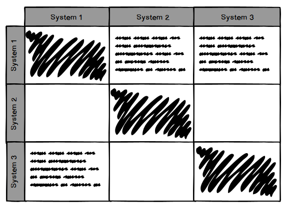
The closest to what I was looking for was an example from the University of Bristol’s EA, from 2012: https://enterprisearchitect.blogs.bristol.ac.uk/category/interface-catalogue/ but I felt it didn’t go in depth enough and while it was easy to fill out, it wasn’t standardized to easily analyze. I also liked the idea from TOGAF of a matrix listing all systems along the top and side, then at the intersection documenting the actual interface (see an example below). Then I realized that with almost 700 systems (and growing every month) it would be unreadable!
Eventually I combined a number of different sources and ideas (including running it past a colleague and the boss) into one catalogue as an Excel spreadsheet saved on our EA SharePoint site. I used a few loose guidelines as I created a basic template:
- source and target had to be items already in our information system catalogue, to make use of information already entered there
- as much as possible, provide validated options instead of free form text to make it faster to enter information and provide standard values across varying size systems
- had to be easily accessible by the many different system owners to edit and view
- capture not only the technical details of the interface but the business need, age/system lifecycle status, and data characteristics
Here are the columns of the spreadsheet, along with the description provided to the user as guidance. I did use a bit of Excel magic for data validation, pulling in data from the information system catalogue, and formatting, but nothing overly complicated.
Identifying Characteristics
- Name/description of interface – identifier for the feed or interface
- Purpose of interface – in business process terms
- Location of interface – URL, server, file location
- Source of data – from the EA information system catalogue
- Technical source of data – database scheme or view, file, name of web service, etc.
- Destination of data – from the EA information system catalogue
- Technical destination of data – database scheme or view, file, name of web service, etc.
- Lifecycle status of interface – see the EA site for details
- Values: Watch (W), Research and Development (R), Investing (I), Sustaining (S), Containing (C), Deprecating (D), End of Life (E)
- Year of implementation – when was the interface created or significantly updated
Interface Characteristics
- Type of data flow – one-way batch file, 1 way sync, 2-way sync, REST service, SOAP, messaging, custom script, database link, etc.
- Frequency – how often the data is accessed
- Values: Real-time, Event driven, Hourly, Multiple per hour, Daily, Multiple per day, Weekly, Multiple per week, Monthly, Multiple per month, Per term, Annually, Ad-hoc
- Throughput (per transaction) – how much data is transferred per transaction/call
- Values: Very Low (1 record per transaction), Low (< 100 records per transaction), Moderate (100 – 1k records per transaction), High (1k – 10k records per transaction), Very High (> 10k records per transaction)
- Throughput (total) – how much data in total is transferred (how many records)
Data Characteristics
- Data object types exchanged – type of data, choose all that apply
- Values: are a list of our common business object types such as identity, roles, HR, accounts, etc.
- Data object types exchanged (details) – additional details on the data types, if clarification is needed
- Data classification – choose all that apply, see the EA site for definitions
- Values: Restricted, Limited, Internal, Public
- Data transformation – none, transformed via spreadsheet formula, script to manipulate data, manual transformation, etc.)
Technical Details
- Data exchange format – XML, CSV file, JSON, comma delimited, custom/proprietary format, standard format, etc.
- Data encrypted – is the data encrypted
- Values: Encrypted, not encrypted
- Implementation technologies – Java, Perl script, Oracle queues, PL-SQL. List as many as needed
- Developer source – is this custom development or provided by the application/vendor
- Values: Custom development, Application/vendor provided, Open source, Standard protocol, Other (provide details in comments section)
Additional Details
- Contact person/team – who to contact for more information about the interface
- Comments, additional details, and relevant documentation – Anything additional to clarify or inform
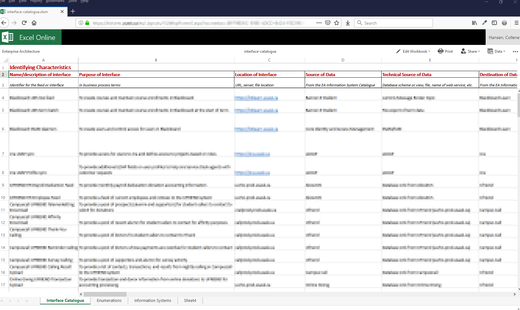
I can’t provide an example that isn’t linked to an authorized data source, but here’s an obfuscated screenshot of the catalogue to show the basic idea:
I’m pretty happy with the resulting template. After running it through my first set of guinea pigs volunteers, I think it balances the need for data versus onerous data entry. As with anything new, there have been some learning opportunities, like: what to do for targets or sources outside the organization (which we haven’t solved), and when do you separate an interface into two (when you need to select more than one item from a single-selection drop down). I’m sure we’ll learn more as we fill out the remaining 500 systems left to inventory…
As a visual person, I wondered if there was a way I could take the data on the catalogue and turn it into a visualization that shows how data is flowing between our systems. It could provide an intuitive representation of the complexity we’re trying to describe, in order to make the case for integration improvements. After some spreadsheet munging and JavaScript charting library investigation (which I’ll admit was waaaaaay too fun), I came up with a 3D force graph.

This isn’t a graph of our actual interface catalogue (it’s too new yet to generate something this interesting), but uses a fake set of random data. Each node in the graph is an information system and is labelled (like Emma). The color of the node represents the team who owns the system. The edges (arrows) show the direction of data flow from source to target and are labelled using the interface name. The edge color represents the source of the data so that all arrows of the same color are from the same source. What you can’t see is that the arrows are also automated — the dots change in size and speed based on the throughput and frequency values from the catalogue. You can spin the image and zoom in/out to focus on certain areas of the graph. What’s super cool is that I can pull the data from the spreadsheet and generate the graph data automatically when the spreadsheet is updated, all because we put some thought into the standardized values.
Eventually I suspect the graph will resemble one great big knotted ball, and it will visually show an important concept we’re trying to convey: one or two point to point integrations aren’t a problem and on their own don’t cause complexity. Complexity happens when we have n x n interfaces so intertwined that when you pull on one of those threads the entire ball unravels. It’s mesmerizing to watch the graph, and even the simple graph tells some interesting stories. For example: one of our systems (providing identity management) is ultimately the center of our integration universe, and another set of applications is entirely separate from the rest but for one lone link that pulls data for the other systems it links (which not surprisingly is an LDAP server).
My next steps are to continue harassing politely nudging colleagues to fill out the catalogue and use what we’ve learned during the analysis phase of our integration hub implementation. So (just warning you) I’ll be writing a lot about integration as I’m sure it’ll be on my mind 🙂
